The premise
Every party deck I had bought ran out by the third round. The cards stopped feeling like this group. They were written for nobody in particular. The fix was not a bigger deck. It was a deck that could adjust to whoever was in the room.
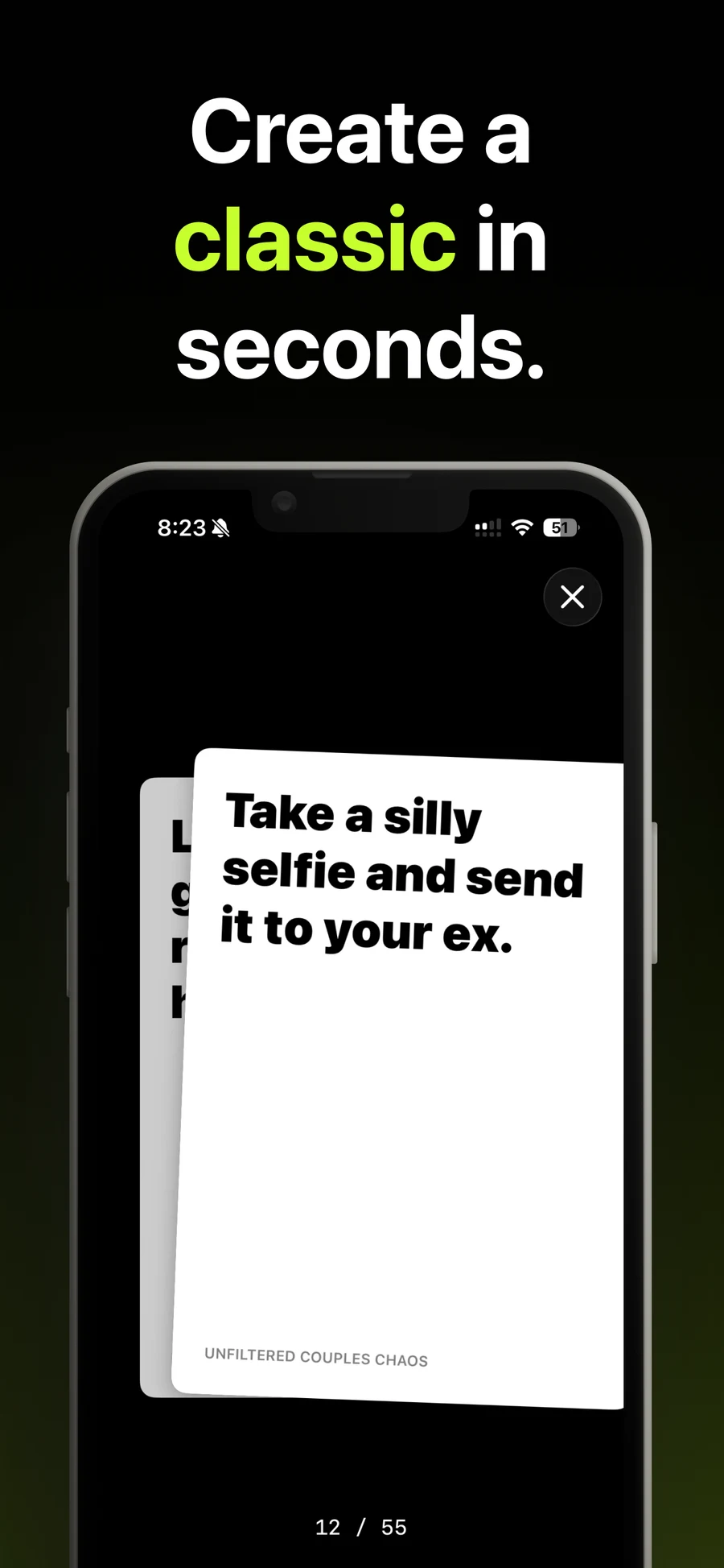
So I built one. Tell it who is playing and what kind of night it is, and it writes a deck in seconds. Edit any card that misses. Then swipe through it one-handed. Right to play, left to skip.
Apple said no
I built it as Drunk Cards. Under that name it never reached the store at all.
App Review rejected it as spam — the name and the branding, not the code. That is not a verdict you argue with. It is one you work around.
I could have filed off the edges and resubmitted under a duller name. Instead I used the block. A drinking app has one occasion, one audience, and a permanent ceiling on where it can be recommended. The name had to change regardless, so the product could stop being about drinking.
Apple rejected a name. What it bought me was a hard look at how small a market I had picked.
What changed
The generator stayed. Everything framing it moved.
The old build asked for a game type — Truth or Dare, King’s Cup — an environment of House Party or Bar, and an intensity that topped out at Unhinged. The current build asks for a deck type: icebreakers, story prompts, hot takes, challenges. The setting is a game night, a road trip, dinner, or a team offsite. Intensity became tone: light or bold. Only “who’s playing” survived untouched — it already offered coworkers and strangers, which in hindsight was the tell.
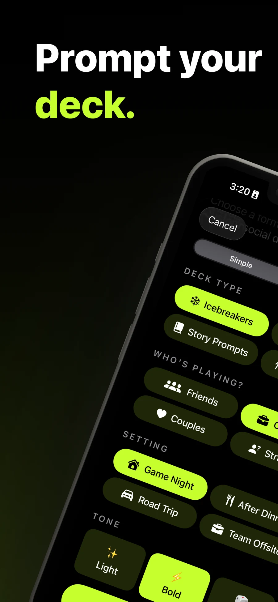
Same engine, wider door. A team offsite and a pre-game want the same thing from software — a prompt that makes people talk — and only one of them can be advertised on the App Store.
It went live as Pandora’s Cards on 25 June 2026.
How it works
Three pillars do the work:
- Create. Start from a prompt or a quick-start theme. Pick the audience, setting, and tone. Edit, remix, or rewrite any card after it generates.
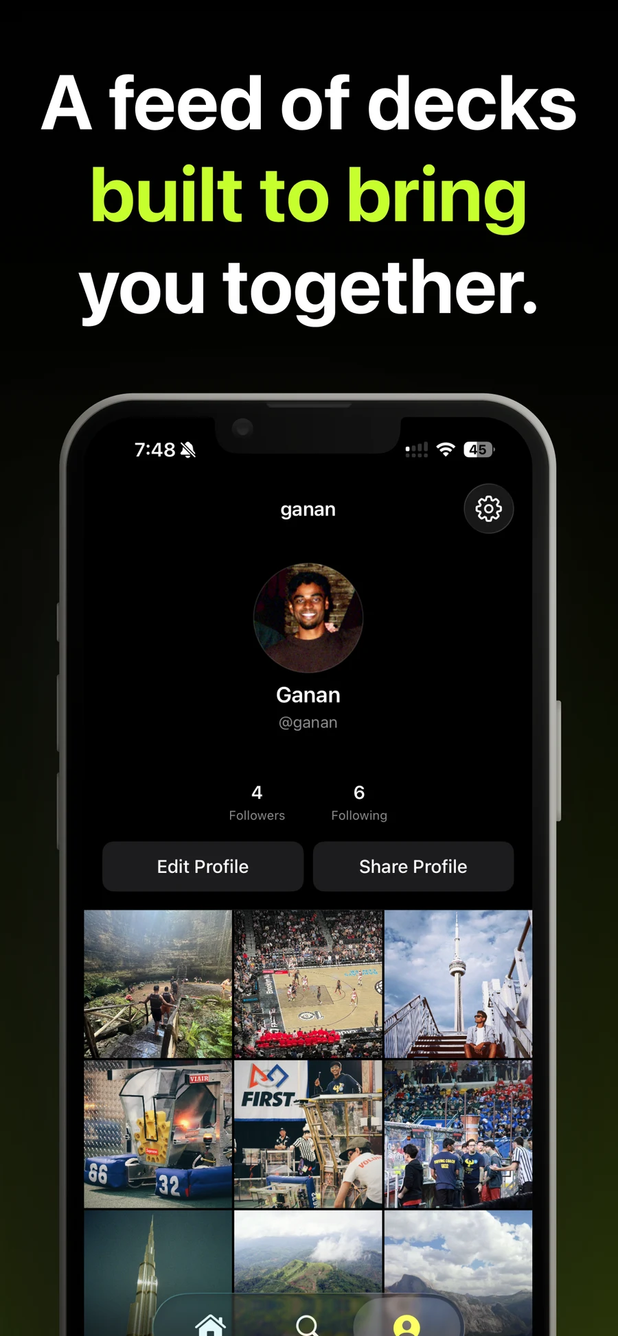
- Discover. A feed of what creators are publishing, browsable by theme and mood. Trending shows what is actually being played tonight.
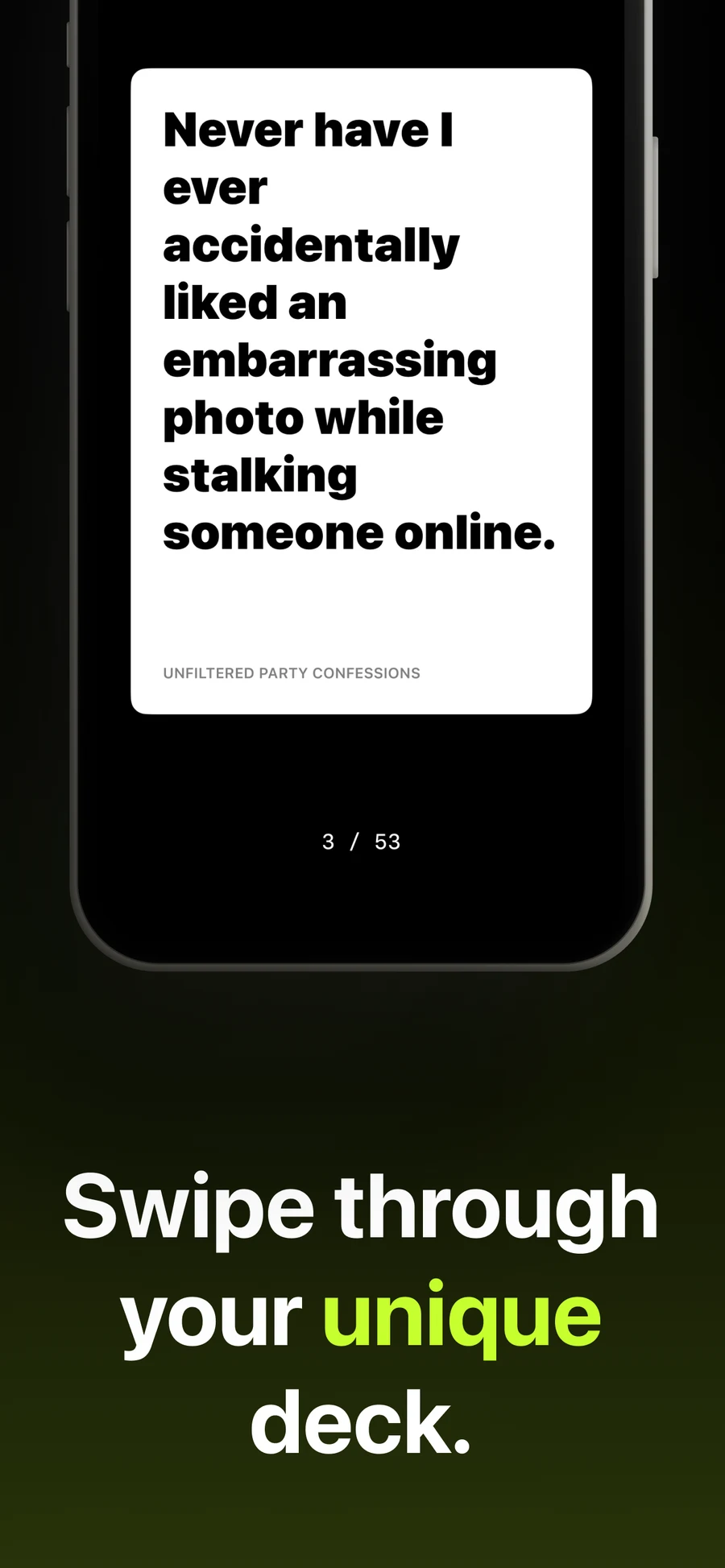
- Play. Full-screen cards, oversized type, one swipe. Fully offline once a deck loads.
Design language
This is the file the rest of my portfolio inherits from. A few decisions did most of the work.
Dark backgrounds, on purpose. The app gets used in rooms with the lights down. A bright white screen burns in those rooms. Near-black is the only honest default. The portfolio took the same baseline (#0a0a0a over #000) because the same restraint reads as premium in a quiet room too.
Oversized editorial typography. Cards are read at arm’s length, across a table, by people who are not paying full attention. Anything under about 24px misses. That habit became this portfolio’s display scale — type big enough to be part of the design, not just the carrier of it.
One accent, used sparingly. A single bright colour marks the primary action and almost nothing else. That is the rule this site’s lime follows: one or two moments per scroll, never more.
Motion that costs nothing. Swiping is the whole interaction model, so each swipe has to feel substantial without dropping frames. transform and opacity only. The same budget applies here.
Tech and decisions
- Native iOS for play. Swipe UX lives or dies on input latency and offline behaviour. A web wrapper could not hit either bar on a phone with two bars of signal and a dying battery.
- Next.js for the web. It runs the marketing site and, on a separate app subdomain, the pages that play a published deck in a browser — so a deck has a real URL to send before anyone installs anything.
- Supabase for the backend. Auth, Postgres, and storage in one, which is the right trade when the whole team is one person.
- Generation is the product. Browsing, following, and publishing exist to make decks findable and creators visible. They give people a reason to open the app on a night they were not going to make a deck.
What I took from it
- A blocked build is cheaper than a launched dud. Apple reviewed a name, not a market. But being made to pick a new name is what got me looking at the market, and I would not have looked otherwise.
- Name the widest true thing. Drunk Cards described one night. Pandora’s Cards describes what the generator does. I had picked the narrower name first and called it focus.
- The product is what the user feels in their thumb. Every decision routed back to the swipe: colour, type scale, motion, even backend latency. This portfolio is judged the same way, by the second scroll rather than the first.
Try it
Free on iOS. pandorascards.com has the full pitch and the App Store link.