The premise
Every party deck I’d bought ran out by the third round. The cards stopped feeling like this group. They felt generic, written for nobody in particular. The fix was not a bigger deck. It was a deck that could adjust to who was actually in the room.
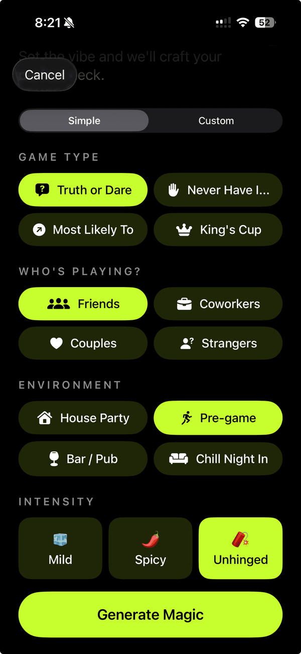
Drunkcards is the result. Tell it what kind of night you’re running: a bachelorette, a couples’ game, dorm icebreakers, or a road-trip pre-game. It drops a custom deck in seconds. Pick a spice level, choose the deck size, edit any card that misses, and start swiping. Right to play, left to skip. It was designed for one-handed use in a dark room full of people.
Design language
This is the file the rest of my portfolio inherits from. A few decisions did most of the work.
Dark backgrounds, on purpose. Drunkcards is used in bars, basements, and back patios. Those are places where a bright white app burns. Near-black is the only honest default. The portfolio took the same baseline (#0a0a0a over #000) because the same restraint reads as premium in a quiet room too.
Oversized editorial typography. Cards are read at arm’s length by people two drinks in. Anything below ~24px misses. That habit became the portfolio’s Instrument Serif display scale. The text is big enough to be part of the design, not just the carrier of it.
One accent, used sparingly. Drunkcards uses a single bright color for the primary action and almost nothing else. Everything else stays neutral. That is the same rule the portfolio’s lime accent follows: at most one or two moments per scroll.
Motion that costs nothing. Swipes are the entire interaction model, so each one has to feel substantial without dropping frames. The same budget applies here: transform and opacity only, GPU-cheap motion, and no scroll jank.
Every swipe feels expensive. In a good way.
— One of the early testers
How it actually works
Three pillars do everything:
- Create: Start from a prompt or a quick-start theme. Pick audience, spice, and deck size. Edit, remix, or rewrite any card after generation. Upload custom cover art for decks you want to publish.
- Discover: Scroll what creators are publishing right now. Browse by theme, tag, mood, or creator. Trending surfaces what is actually being played that night.
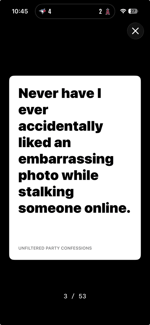
- Play: Full-screen cards, oversized typography, and one simple swipe. Fully offline once a deck is loaded. Right to play, left to skip. Zero rules, zero setup.
Tech and decisions
- Next.js and React for the web companion. Server-rendered marketing pages with Next.js Image keep Lighthouse honest and let the deck pages share the same component model as the app.
- Native iOS for play. Drinking-game UX lives or dies on input latency and offline behavior. A web wrapper could not hit either bar reliably enough at 2am on a phone bouncing between bars.
- AI deck generation as the core feature. The prompt-to-deck flow is the product. Browse, follow, and publish all exist to make decks more findable and creators more visible.
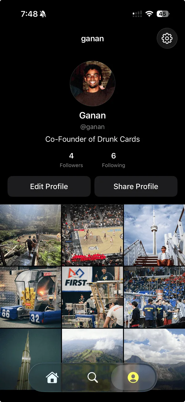
- Creator profiles as deck portfolios. Publishing a deck is a first-class action. The goal is closer to a small social platform with a generator inside it than a one-shot generator.
What I took from it
- The product is what the user feels in their thumb. Every decision routed back to the swipe: color choices, type scale, motion, and even backend latency. The portfolio uses the same lens. Every section is judged by what it feels like on the second scroll, not the first.
- Restraint reads as quality. One accent, one display font, and one motion vocabulary. Easier to ship, easier to maintain, and easier to recognize.
- Ship the marketing site as part of the product. The web companion is not an afterthought. It is the first impression and the design system spec at the same time. This portfolio is built the same way.
Try it
Free on iOS 18+. Visit drunkcards.io for the full pitch and the App Store link.